By Ellen Finkelstein
Create PowerPoint charts that compare 2 types of data
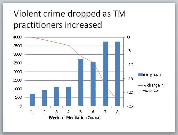
How do you create a chart in PowerPoint that looks like this? It has:
•2 different Y-axes each with a different scale
•2 different chart types–column and line

I learned this feature of PowerPoint charts recently from my friend and fellow PowerPoint MVP, Echo Swinford. She is one of the top experts in the world on PowerPoint and specifically PowerPoint charts.
Charts like this are very useful when you’re comparing 2 very different types of data. This chart is from a course of practitioners of the Transcendental Meditation technique that took place in 1993 in Washington, D.C. It compares police statistics of homicides, rapes and assaults during the course with the number of people who were on the course, which lasted 8 weeks.
Here’s what the data looks like in Excel.

Note: I found the actual chart online and estimated the numbers from the chart. I didn’t have the actual numbers, so these numbers will be slightly different from the numbers used in the study.
Follow these steps to create a chart like this in PowerPoint 2007 or 2010:
This post is excerpted with the permission of PowerPoint Tips.


