By Ellen Finkelstein
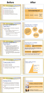
This past month, I did two makeovers–one for a long-time friend who was presenting at an academic conference and the other for a business partner. Since I wasn’t getting paid, I went through them fairly quickly and by the time I had finished both, I realized that I had a simple system that I could share with you.
Do you sometimes want to quickly make a presentation look better without changing the content very much? In these two instances, I wasn’t at liberty to reorganize the content or change the number of slides much, so I had to make simple changes. Yes, I would have liked to do a more thorough job, but …
Step 1: Apply a better theme or template
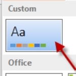
I have created a PowerPoint theme that has the settings I want for font, font size, title justification and more. It has a plain white background and I find it to be a good place to start. In my tip, “Create a better PowerPoint template,” I describe this template/theme.
This step cleans up a lot of messes.
Step 2: Format the background
If the presenter wants a background other than plain white, I add it here. My preference would be for a simple gradient, but my friend wanted something more interesting than that, so I took the background she had chosen and deleted some of the elements, leaving a simple, textured bar.
Step 3: Reset the slides
People fiddle with their slides too much! I recommend using the layouts that come with PowerPoint (or creating your own if you have 2007 or 2010), but not moving things around too much, unless you’re a designer or unless the slide absolutely requires it.
The result of all this fiddling is:
Resetting a slide moves everything to match the layout. So I reset most of the slides. I explain how in my tip, “Resetting a slide: A quick fix for awful slides.”
Often, I change the layout, too. I can’t tell you how many times I see a slide with empty placeholders on it. It’s so annoying to work with those empty placeholders on the slide (even though they don’t show up in Slide Show view). By choosing the most appropriate layout, I make my editing easier and ensure consistency.
Article continued here
This excerpt is shared with permission from ellenfinkelstein.com.


