By Ellen Finkelstein
Graphs (called charts in PowerPoint) are an important part of many presentations, especially ones with financial data. In this tip, I include the basics for creating a readable, effective graph.
For a special technique, read another tip, ” Push PowerPoint charting options to the limit.”
First, some basic steps:
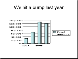
Know that PowerPoint’s default formatting is never acceptable. That’s right, never. So you might as well learn how to change the formatting. Here you see the default chart using the blank template in PowerPoint 2003.

Here are the problems:
- The 3D effect is confusing. Does the front or the back of the column represent the actual number? (Luckily, the default in PowerPoint 2007 and 2010 is for a 2D chart.)
- You don’t need the legend on the right, because it will be obvious during the presentation that you’re talking about revenue. The legend also forces the graph to fit into a smaller space.
- The horizontal grid lines help gauge the value, but they’re ugly and distracting.
- The bars are too far apart from each other, which makes seeing the trend more difficult.
- The bars could look more interesting!
Here is one way you could change the chart:
Article continued here
This excerpt is shared with permission from ellenfinkelstein.com.


