It’s here, it’s public and it’s time to give it a spin. My Windows 7 beta 64bit download was fast and uneventful. While it was downloading I dropped a new hard drive into my existing work box.The system is a couple of years old now and was built using a MSI P35 neo motherboard, Q6850 Intel Quad core, 2 gigs of memory and a once decent 8800GTX vid. card. A nice box when new, but now showing it’s age. I’ll need to double the memory for this to really be ready for Windows 7 and 64 bit computing, but I can add that later. Here are some PC Pitstop test results: [OVERDRIVE] and a more recent setup [OVERDRIVE]
When Vista first appeared I couldn’t wait to get my hands on it. It didn’t take long before I realized it was not ready for prime time. It lived quietly on my laptop while recovering from its UAC-pendectomy. There I monitored Vista’s turbulent teen years and dosed it with SP 1 and other medications. It seems now to be past its original seizures, but still gives way to XP for work. So it’s with this background that I look forward to an updated MS operating system that is not saddled with the poor genetics that caused Vista’s demise.
Installation was slick and easy because the included driver support seems to be excellent. The only drivers needed were wireless drivers, which seem to be a universal problem for Windows 7 64 bit. There’s also a still missing bus driver. Unavailable now I’m sure they’ll show up eventually. I hooked up a standard wired internet connection and connected without problems. Basically up and running in about 40 minutes. Prompts during the install were few and familiar, the only thing new being the Home Group. More on that later but basically it provides an interface for sharing pics, documents,and music within a Home Network.
WINDOWS 7 NEW OR UPDATED FEATURES |
||
| 1 | Installation | Extremely smooth. New Home Groups prompts |
| 2 | Drivers | Excellent out of box experience. Missing Wireless but wired is fine. |
| 3 | UAC | Big improvement on boot is immediately obvious. Handy slider for adjusting settings. |
| 4 | Applications | NotePad, WordPad, StickyNotes, Paint, Gadgets. |
| 5 | Live Essentials | Mail, Live Writer, Media Center. Sky Drive is especially nice. |
| 6 | Control Panel | Increased number of items to 53 from about 36 in XP..The New Action Center is big news. |
| 7 | Libraries Documents | Documents in multiple locations but appear in one location. |
| b | Credentials | Saved passwords. It’s a wonderful thing. |
| 8 | DeskTop | Search improved, SuperBar allows arrangement of icons in SuperBar |
| 9 | Internet | Excellent auto configuration as with Vista, No wireless drivers yet. Networking much improved. |
| 10 | Display | Dual Monitor configuration on first boot, View desk top button is very slick, SnapTo and Preview not so much. |
During the installation I worried that configuring my dual monitors would be a problem but at boot the monitors were set using span view and all resolutions were correct. All I did was remove the boring Beta Splendens and click the latest Scenic Ocean background and bingo, we got beauty!
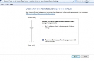
UAC was my next concern. An accepted irritant in Vista, I was ready for continued problems in Windows 7. I was surprised when I realized I was unaware of it so far. Hadn’t received a worthless warning yet. Maybe I’ll leave it as a test to see how long before I tire of it. I’ve already read that adjusting it is much easier now and enables a user to choose the amount of irritation he wants. This is it’s intention you know. It’s intended to irritate us into not running with Administrator privileges. As of this moment, I haven’t adjusted it at all. With that being said, I went to Control Panel /Action Center/Change UAC settings/ and looked at the slider for adjusting to the desired level of irritation. Nice job, this is way less intrusive than Vista’s original UAC configuration. Yes, I’ll just leave it.
SIDE NOTE: News Flash! Microsoft has returned the [shut off] button. They didn’t put it out there in plain sight on the desktop,the still hide it a little but it’s one click closer. Clearly MS needs to take a hint from Nike and JUST DO IT.
The Action Center mentioned above is where the new and improved UAC controls are, but it’s also home to other important features for maintenance and security. Notices for Windows Firewall and Virus protection are here along with revamped Backup options. The Action Center is where to go to consolidate notifications in the task bar and reduce internal popups.
Applications
Paint has finally been upgraded with new features for transparency added. Not earth shattering but still an upgrade and it’s early yet. I’m sure by midyear there will be even more improvements. Its also enjoying the new ribbon look to cap off the changes.
I’m not sure how much effort Microsoft should put into older applications like Paint and Word. It might be better to concentrate on creating new apps. while the switch to cloud computing and all things browser controlled takes place. I imagine they are just keeping us pacified while the switch happens.
Add-ons for Windows are a trend that started with Vista and continues with Windows 7. What used to be included with the Operating system; Outlook Express Mail and Media Player must now be downloaded separately and are included in the new Windows Live applications.
I’m kind of blown away by all the Windows Live applications. Sky Drive, what a deal. 25 Gigs of free storage space that I can use and operate for file and picture sharing. I’ve already added the Windows Live Mail which is funneling Gmail and Comcast.net mail without problem. LiveMail has a nice interface and loaded my over 2000 saved emails without much effort. I don’t believe it’s going to be a problem getting comfortable with it. Layout is intuitive and simple. Most of the commands are along the top of the application and the InBox, Saved, Deleted items are along the left margin. Will check some of the included feature but so far I’m liking it.
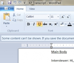
Windows Live Writer immediately caught my eye. I’m hoping it’s going to be a nice addition. Right now my options are Windows Live Writer, the old and tired Notepad, a revamped Word Pad, and the new and quite handy Sticky Notes. I know Sticky Notes are no big innovation but they’re nice for holding short term info on the desktop untill needed. They are easy to color code and with no effort can have your desktop looking like a Soccer moms frig. What I’m not seeing is Robs wish for a new and improved notepad with spell check, auto-save or close tags. The newly updated WordPad might be just the ticket. Sporting a new ribbon bar, it’s a slimmed down version Office Word 2007. Slimmed down yes, but still allowing for text editing, adding a pic, and even viewing docx files. That’s enough right there to make a lot of people happy, just don’t try to edit the imported docx files. The new Live Writer has a spell check, table insert, and a couple of other nice features including the ability to publish in WordPress. Might be just what we’re looking for.
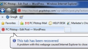
SIDE NOTE: FireFox 3.0 works great with Windows 7. In fact the reason I downloaded it was because of problems with Internet Explorer 8 and WordPress. I kept getting “Tab Recovered” errors and was unable to work in WordPress. Even using compatibility mode was no help. I’ll keep looking for information on a fix, but so far nothing.
Credentials is a feature that really has me excited. I had visions of not having to continually log in and remember passwords to the many applications I use. Alas, that was not the case, but you can bet I’ll continue to work on it. I’m not sure if it’s a glitch in the program or a glitch in the user. I’ll let you know when I get it figured out. If it works it will be a huge time saver for a lot of us.
Update: yes, it was user error. It’s working fine now using the “Generic Credentials” rather than the “Windows Credentials”. I know some Help Desk crews that will love this. Being able to open password protected applications without having to type in the varying passwords will save a boat load of time.
The Desktop: is it like Vista? You bet. Does it have some nice changes? Sure does. First there’s no Welcome Center. The new and improved Welcome Center is now kept under a different name, “Getting Started”, and is found in the control panel. Another item you won’t find on the desktop is the Sidebar. it’s been completely eliminated but there are still Windows Gadgets available by simply right clicking on the desktop.
No more Quick Launch Tool Bar, it’s now the SuperBar. The new SuperBar now allows for changing the order of items and also incorporates the jump lists, which are basically an expanded menu for the applications in the SuperBar. A new “Show Desktop” button all the way over on the right edge is a nice addition. This button makes it easy to clear all the open windows and view the desktop with a single click and then return them. I checked out the new SnapTo and the Preview options but I’m not feeling it for these. Nice gimmick but I don’t really see a use for them.
Networking is getting a big boost with the addition of Home Group. Start/Control Panel/Network and Sharing Center. Pictures, movies, files, printers, and a whole host of other changes involving security and easier access within the network is going to make Rob and a lot of others very happy.
CONCLUSION
It’s a winner. Doesn’t matter to me whether it’s a streamlined Vista or this something more that people are looking for. It’s a very nice improvement and if the rumblings heard in the background are true, it might get to our Desktops sometime in 2009… before the Holiday Sales Season? Now that would be fine with me.
_______________________________________________________________________________________
Excellent Additional Links:
Windows 7 Touch
InfoWorld HOW TO Video
I’m a PC
Beta Build 7025

